Every Breathe You Take
By
Vikas Kumar and Yazhini Rajesh
Getting Started
In order to run this project kindly install the latest version of R studio. Install all the necessary libraries used in the source code (located at the top of the source code) using install.packages(“library-name”). Also make sure to set the directory of R to where the source code is located in your computer.
Make sure to check this video out.
About the project
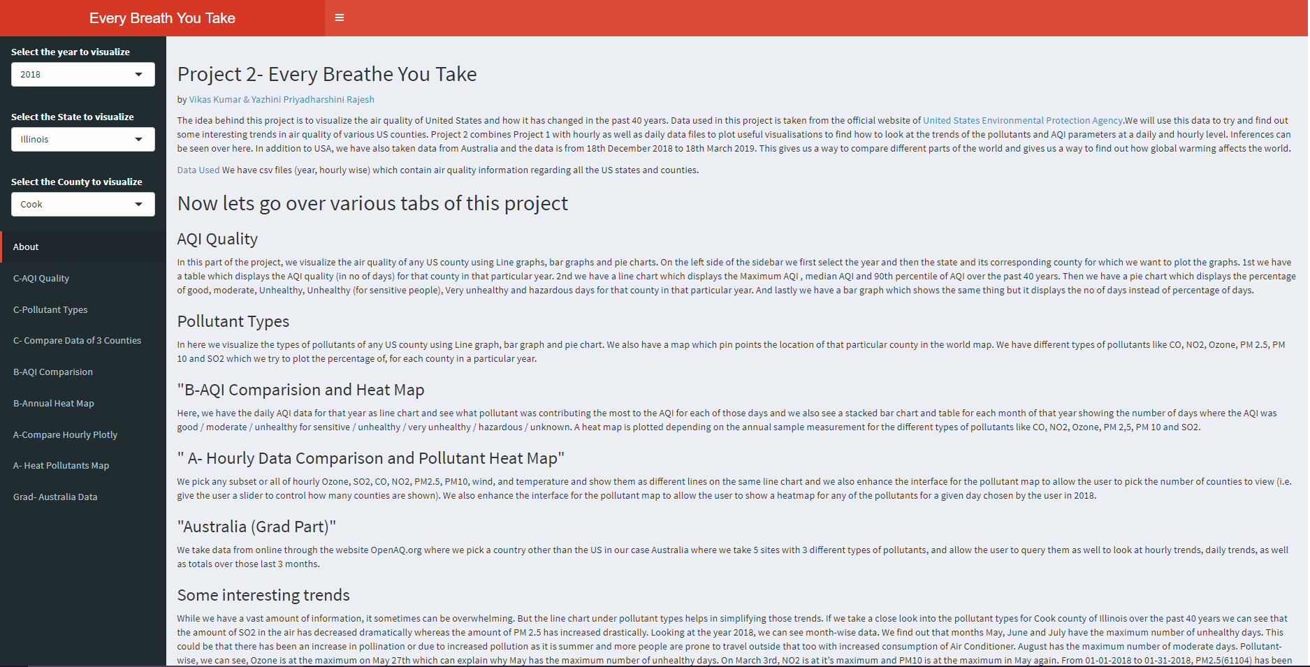
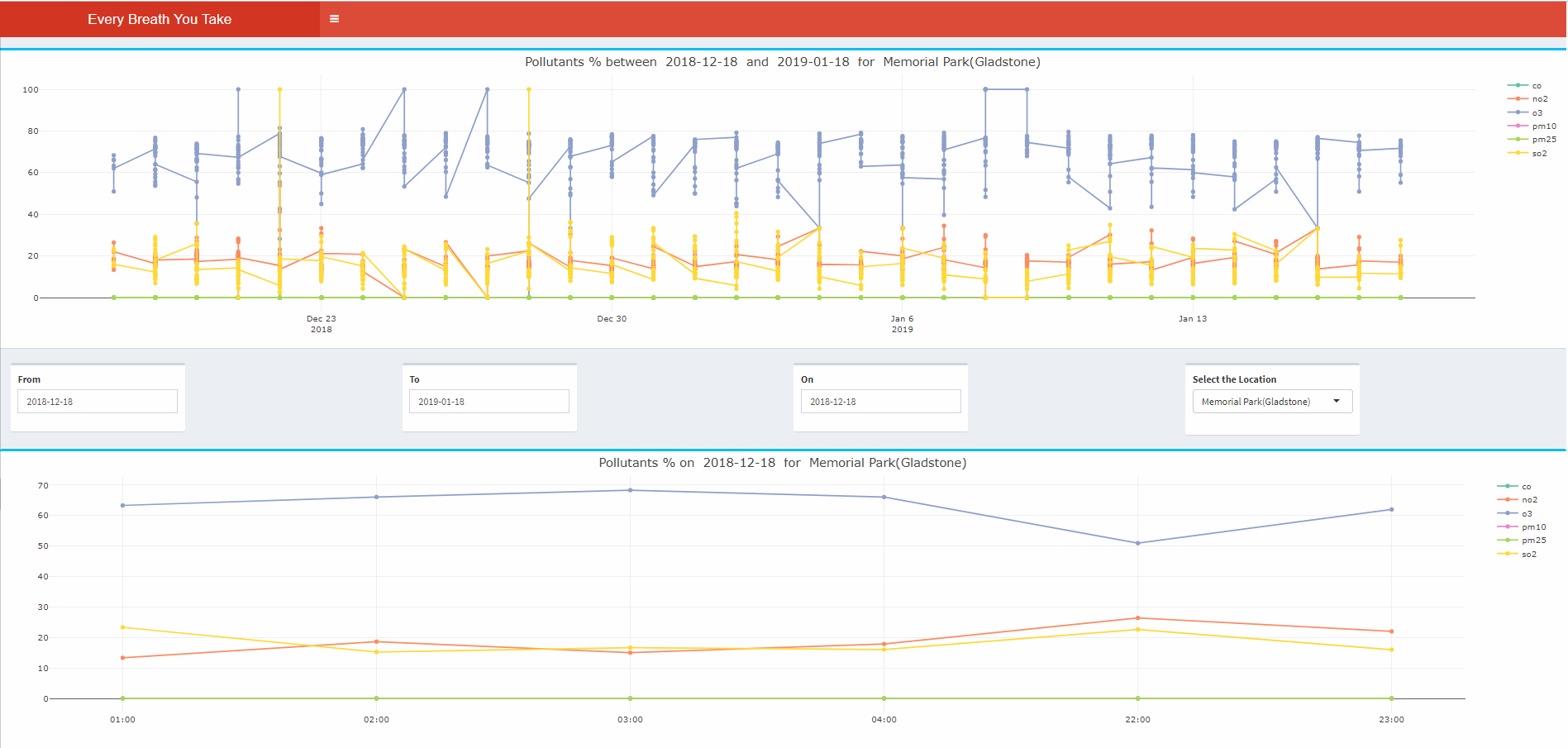
Project 2 combines Project 1 with hourly as well as daily data files to plot useful visualisations to find how to look at the trends of the pollutants and AQI parameters at a daily and hourly level. Inferences can be seen over here. In addition to USA, we have also taken data from Australia in the following locations - (Auckland Point, Memorial Park, Newcastle, West Mackay, Wollonlong) and the data is from December 18th 2018 to March 18th 2018. This gives us a way to compare different parts of the world and gives us a way to find out how global warming affects the world.
The project is broken into 4 parts:
Part C
Here we have allowed the user combined Project 1 with daily AQI Data and plotted a line chart to see what pollutant was contributing the most to the AQI for each of those days. A stacked bar chart and table for each month of that year showing the number of days where the AQI was good / moderate / unhealthy for sensitive / unhealthy / very unhealthy / hazardous / unknown was also plotted.
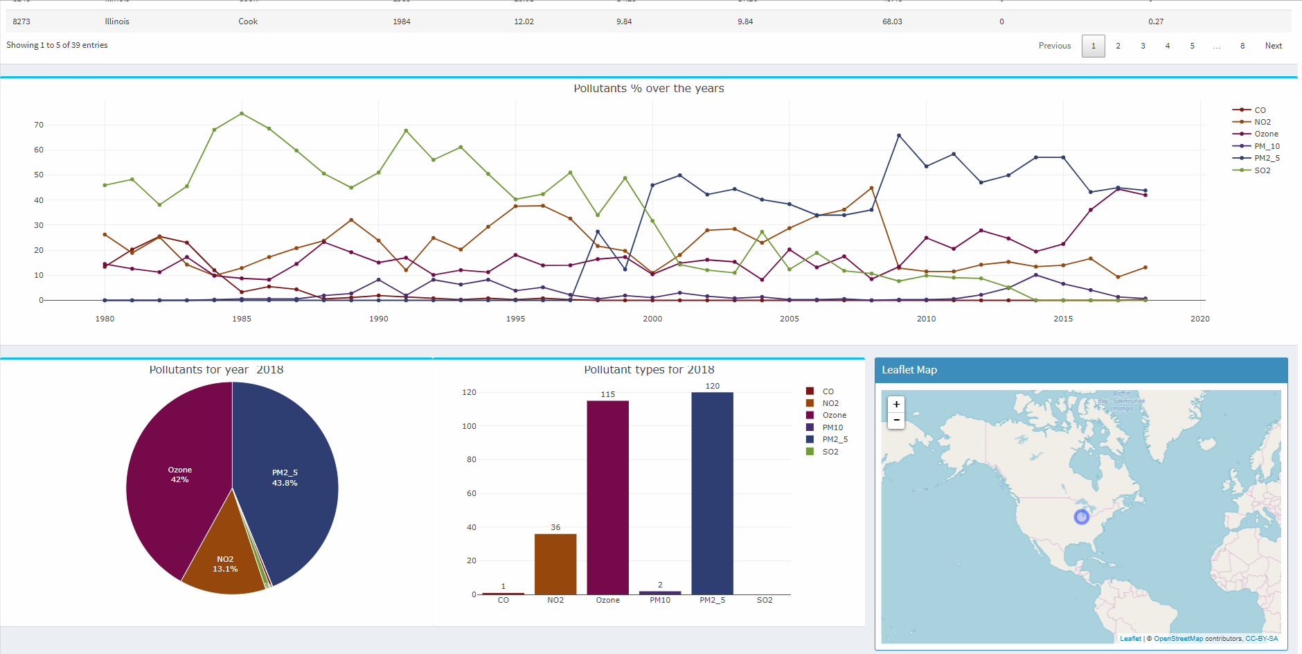
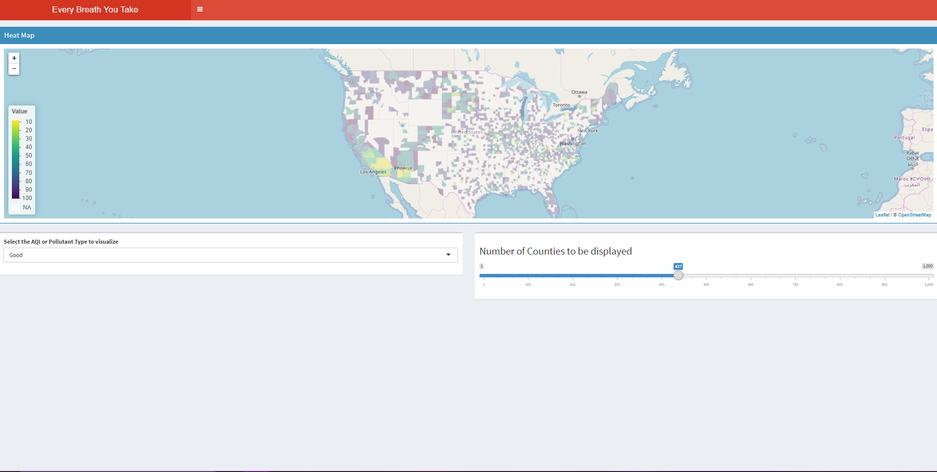
We have allowed the user to choose a year and AQI or one of the pollutants (ozone, SO2, CO, NO2, PM2.5, PM10) and see a map showing the locations of the top 100 counties that have an issue with AQI or that pollutant based on the annual data, in terms of the largest percentage of bad days for that pollutant (e.g. the user could pick 1992 and CO, or 1995 and AQI).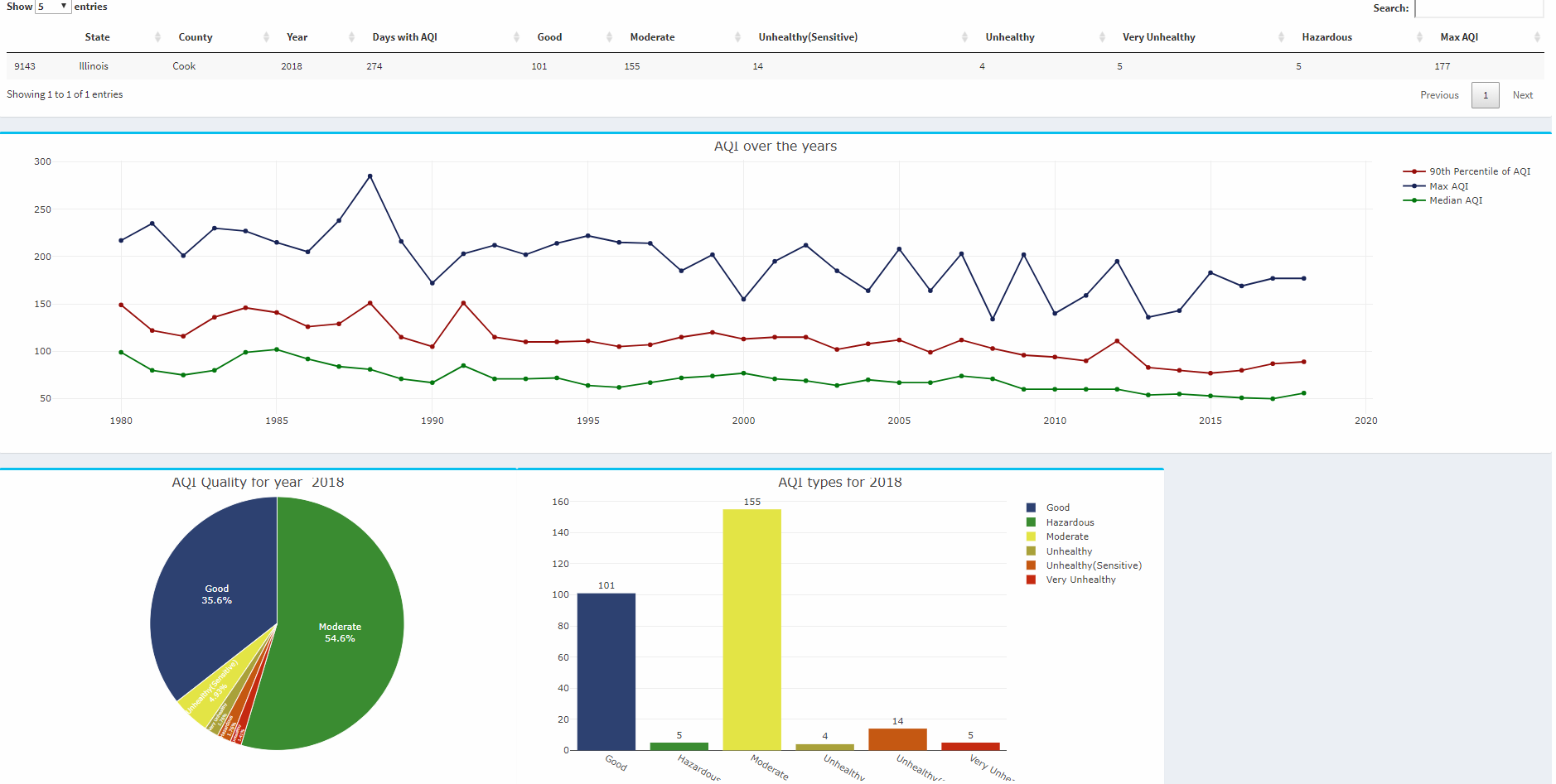
Part B
We have allowed the user to choose one of the 12 counties and then allow the user to choose a date in some intuitive way that shows which days have data and then allow the user to pick any subset or all of hourly Ozone, SO2, CO, NO2, PM2.5, PM10, wind, and temperature and show them as different lines on the same line chart.
We have enhanced the interface for the pollutant map to allow the user to pick the number of counties to view (i.e. give the user a slider to control how many counties are shown). Note that the number of counties with data ranges from around 680 to 800 depending on the year. Allow the user to display values in either imperial or metric units.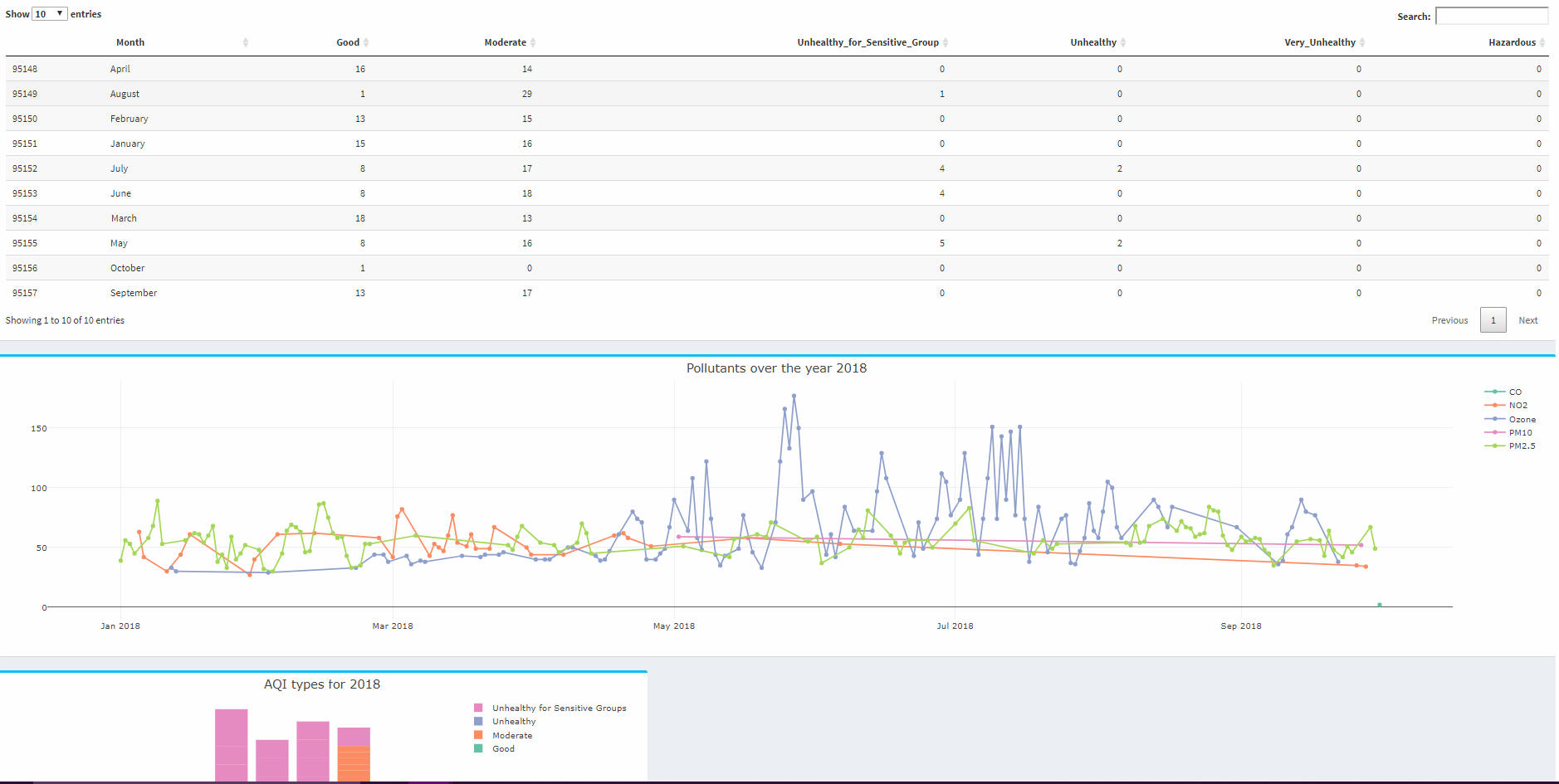
Part A
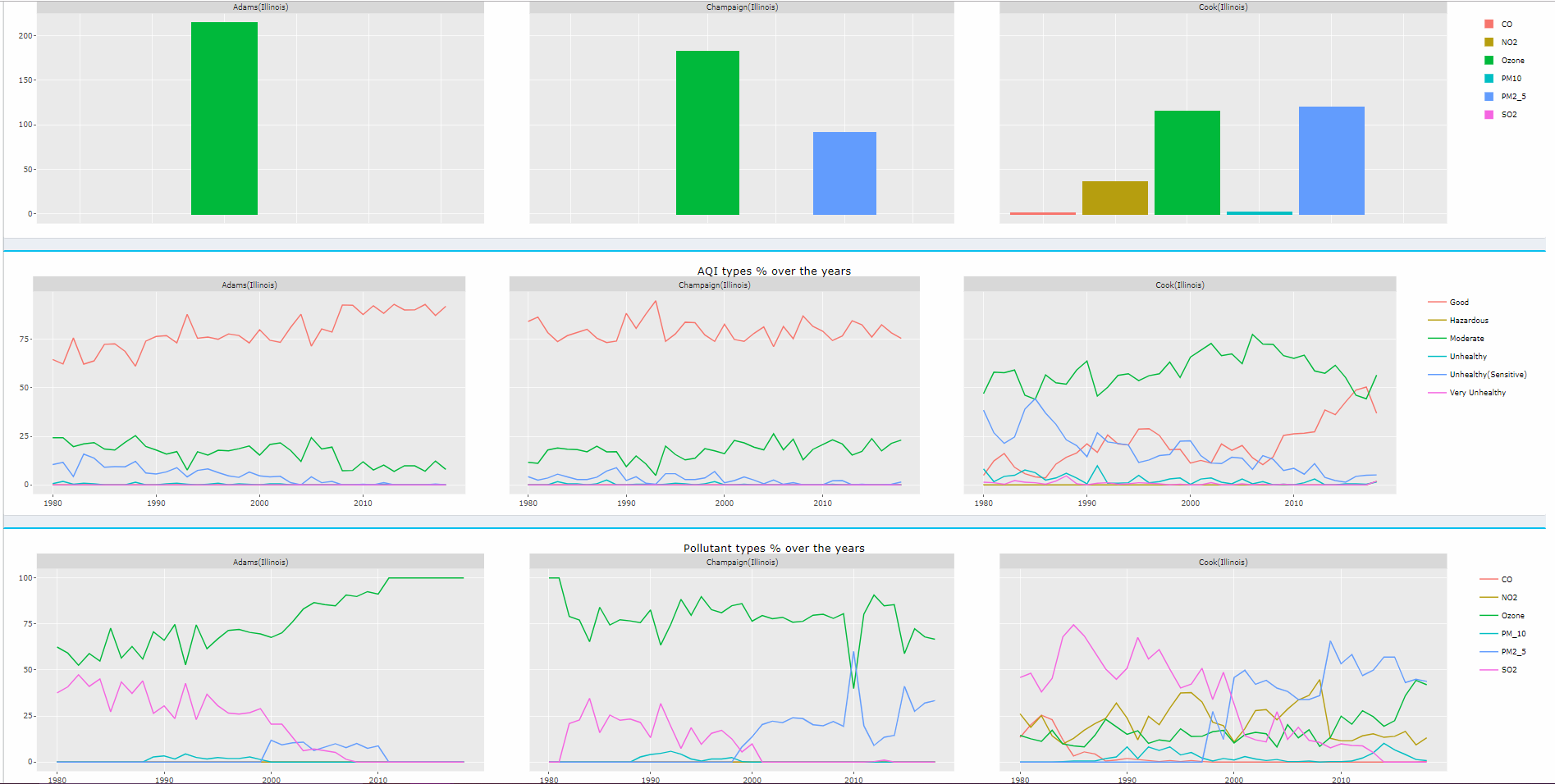
We have allowed the user to choose any county, similar to the A range in Project 1, and any date in 2018 and see the data visualisations from the 'C' and 'B' range.
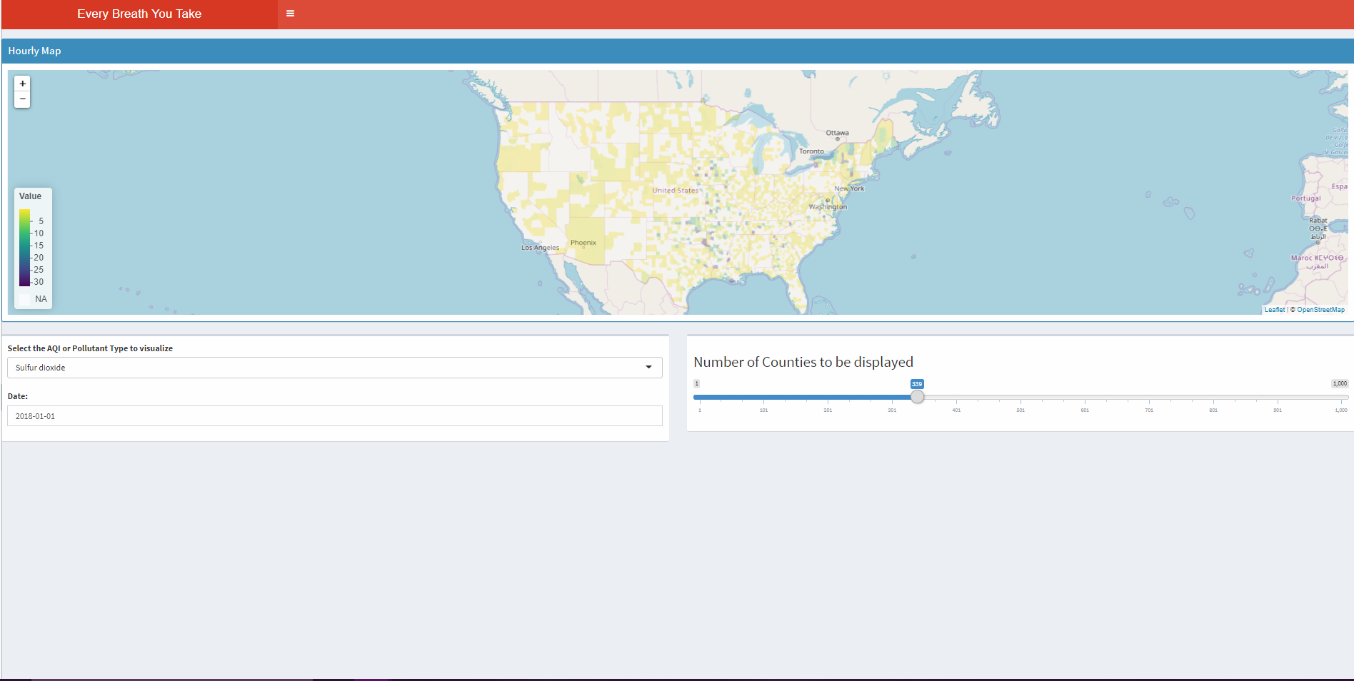
We have also enhanced the interface for the pollutant map to allow the user to show a heatmap for any of the pollutants for a given day chosen by the user in 2018.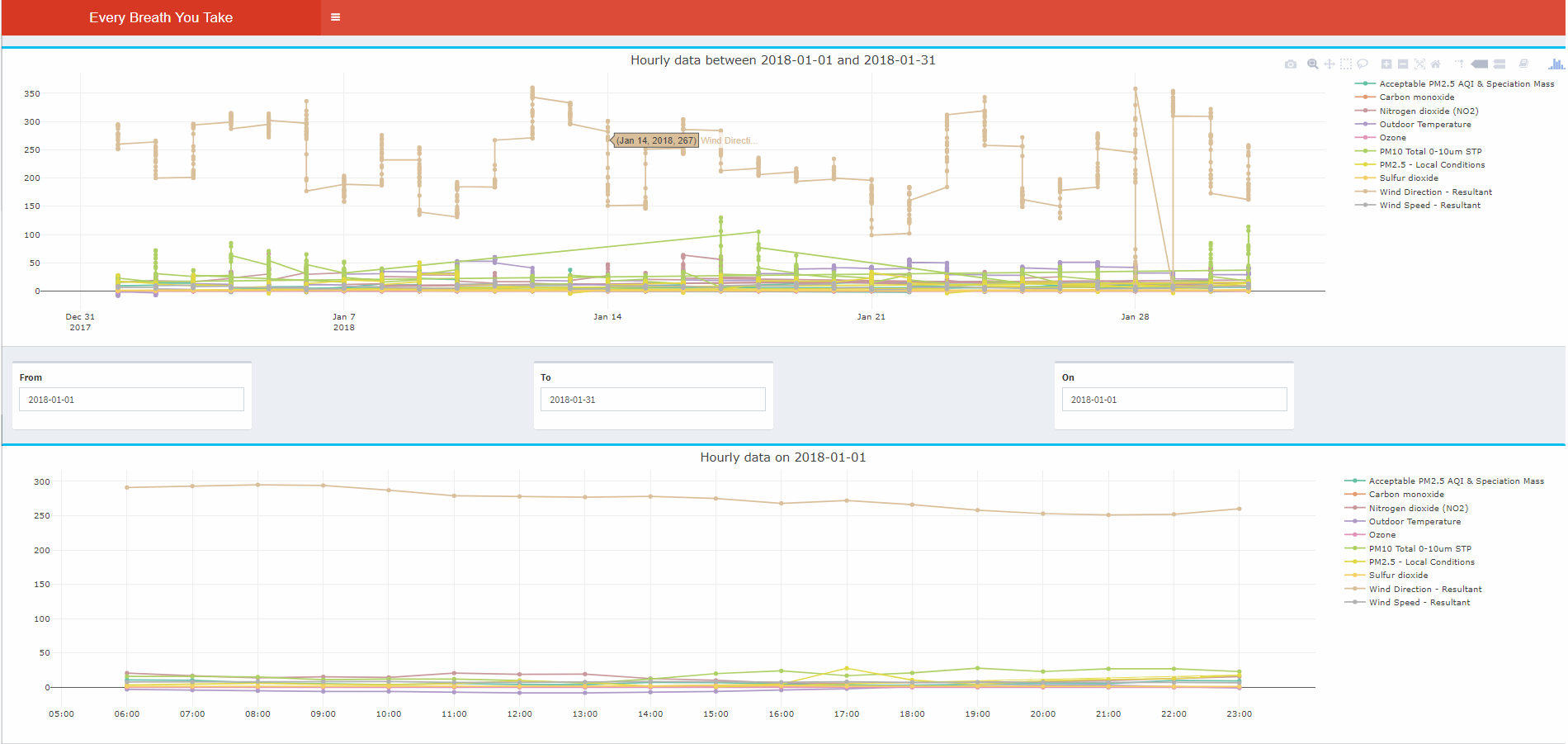
Graduate Students
Data from OpenAQ.org has been picked for a country other than the US that you are interested in that has reasonable coverage for the last 90 days in terms of different sites and different pollutants - with at least 5 sites, and 3 different types of pollutants, and allow the user to query them as well to look at hourly trends, daily trends, as well as totals over those last 3 months.
References
1. Reference code provided by Prof Andy Johnson